I recently came across two bookmarklets that let you view any webpage in multiple screen-sizes and simulate viewing on multiple devices, all inside your browser.
The first I came across was a script by Victor Coulon. He wrote Responsive Design Bookmarklet which places a toolbar at the top of the page. The toolbar includes buttons that let you select between landscape and portraiture mode for a table and phone.
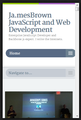
Upon picking each, the UI automatically updates to the selected size and orientation. For example, I visited this site’s homepage and then selected the phone/portrait mode:
You can grab the bookmarklet from his site.
The other bookmarklet I came across was Benjamin Keen‘s Responsive Design bookmarklet. Although similar in nature, his uses iFrames to show multiple resolutions at the same time. Be sure to scroll right to view all the resolutions. Since he uses iFrames, all the links and functionality still works.
Check out both and let me know what you think. Have you found other good Responsive Design bookmarklets I should know about?


2 Comments
I use Victor Coulon’s and I think it’s just great! I haven’t stumbled across any others yet, but I think his has everything I need.